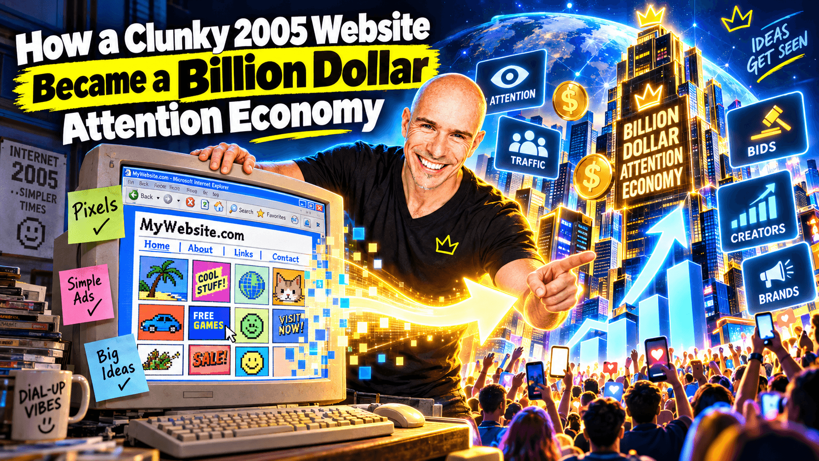
How a 21-year-old student website accidentally invented the attention economy — and what happens when you give the same idea one new rule
In 2005, a British student called Alex Tew built a 1,000 x 1,000 pixel webpage.
He divided it into advertising space.
He sold the pixels for $1 each.
Minimum purchase: 100 pixels.
You uploaded an image, a URL and some hover text.
Your message appeared on the page.
It was supposed to fund his tuition fees.
He called it the Million Dollar Homepage.
It made headlines around the world.
The last 1,000 pixels were eventually sold on eBay, taking the project's reported gross revenue to $1,037,100.
That was the entire pitch.
Twenty-one years later, it still works.
Not because the original site still earns money.
Because the underlying physics of advertising never went away.
That physics is what the Billion Dollar Homepage turns up to eleven.
The Internet in 2005 vs The Internet Now
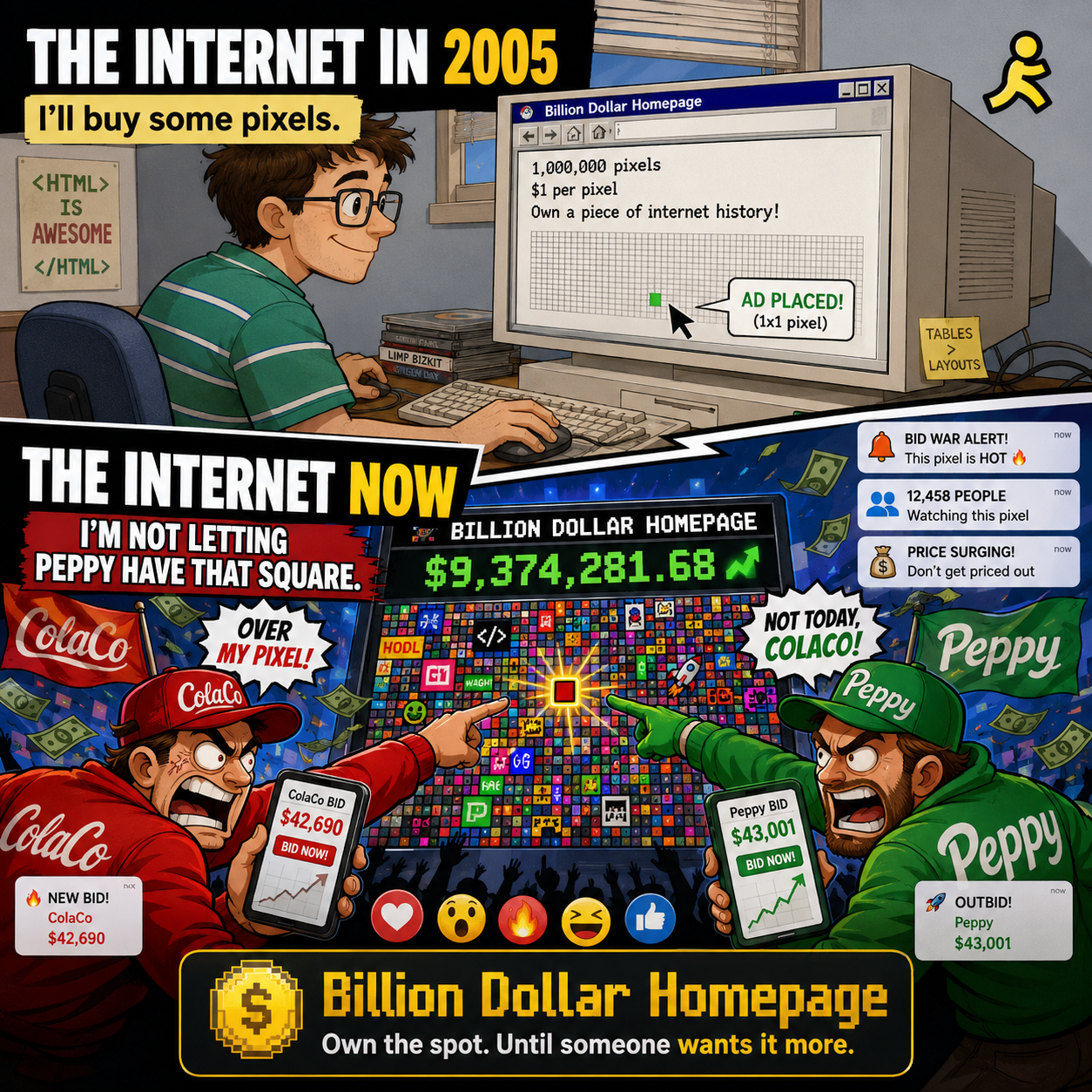
In 2005, the internet was slow, ugly and weird in a way that today's polished feeds no longer are.
Webpages loaded in chunks.
Banners rotated.
Pop-ups popped.
Counter offers, scratch cards, animated GIFs and a million flashing arrows competed for a fraction of your attention.
It looked chaotic.
It was also revealing.
Every site on the web was openly fighting to keep you on the page a few seconds longer.
The aesthetic has changed completely since then.
Apps are calm, dark mode, infinite scroll.
Algorithms quietly choose what you see.
Ads are stitched into the content so politely that you barely notice them.
The attention economy, however, hasn't gone anywhere.
It has simply been dressed up in better clothes.
The Million Dollar Homepage was one of the first crude instruments designed to measure that fight.
The original Million Dollar Homepage was supposed to be a one-time joke
Alex Tew later said the idea came to him because he needed to pay for university and didn't have any other way to do it.
The page was meant to be sold in one pass.
One million pixels. One dollar each. Then the project would stop and everyone would go home.
The cleverness lay in how the format forced the rest of the story.
Selling pixels one at a time took forever. So Tew sold them in blocks.
Larger blocks cost more, which placed the bigger ads in the best visual positions.
Smaller blocks were cheap, so dozens of tiny advertisers crowded in around them.
The page became a mosaic of competing messages.
And a mosaic that fills up generates its own story.
Reporters kept going back to see how full the page was getting.
Every time another patch of pixels was sold, there was a fresh visual change to write about.
That is supply, demand and free marketing in one tidy package.
Scarcity, social proof, virality
The psychology of the original Million Dollar Homepage was closer to a Kickstarter campaign than a traditional banner ad.
The trick was structural.
Several ingredients at once:
Scarcity. A fixed supply: only one million pixels, no more.
Social proof. When early buyers took slots, the page looked busier, and that visual progress persuaded new buyers to jump in before the best spots vanished.
Low entry cost. $100 got you onto the wall, which meant small businesses, online forums and members of the public could actually afford to participate.
Story-friendly. Every transaction produced a visible result, so journalists had something to report on every time the page changed.
Visible drama. The mosaic itself was the story.
Reading the trade press at the time, you can see these forces operating in real time.
The Times and The Guardian and the BBC ran features.
Sold-out maps were screen-shotted and shared.
Latecomers forked out more than the original list price for prime-position blocks.
The whole thing caught fire precisely because it had a beginning, a middle and an end.
Tew made his money.
He took a chunk of it out as eBay bids and called the project done.
Twenty-one years later, that story still teaches marketing undergraduates how to design a launch.
Attention is the product
In 1971, Herbert Simon, the Nobel-prize-winning economist and computer scientist, noticed something about information systems that gets quoted a lot, and quoted correctly.
A wealth of information creates a poverty of attention.
In a world where information is everywhere, the scarce resource is somebody willing to look at it.
That was true before the internet existed.
It is more obviously true now that almost every adult on Earth has a high-bandwidth attention siphon in their pocket.
Every newspaper, billboard, podcast ad slot, influencer mention, Google result, sponsored Instagram post and pre-roll YouTube video is part of the same economy.
They all want the same currency.
Your attention.
And your attention is finite.
The original 2005 ad page was an early, brutally literal example of that.
It wasn't sophisticated. It didn't need to be. It simply pointed out what has been true about advertising forever: scale and visibility are everything.
Twenty-one years on, modern platforms spend hundreds of billions of dollars on the same fight, just with cleaner software.
The primitives never changed.
What the original got right (and could not extend)
There are two parts of the Million Dollar Homepage story I keep coming back to.
One is the launch.
Scarcity, social proof, low entry cost, viral visual momentum. It is a textbook of how to get a self-reinforcing marketing loop going.
The other is the limit.
The page had a hard ceiling.
When the last pixel sold, the story was finished.
The wall remained online, but the economic event was over.
That same quality that made it appealing at launch also made it impossible to extend.
Most digital businesses run straight into the same wall.
The launches are usually great.
The endings are usually boring.
Once the initial audience has gone home, you have nothing left to feed them.
So I started wondering what would happen if you kept the launching mechanism but made the ending impossible.
What if those same pixels never stop being for sale?
What if, instead of the wall filling up once, anybody could be outbid, at any time, for as long as the page itself is online?
That question turns out to be the whole premise of the Billion Dollar Homepage.
One new rule
The Billion Dollar Homepage keeps almost everything from the original.
The canvas is still 1,000 x 1,000 pixels.
Pixels still start at $1 each.
The minimum block is still 10 x 10 pixels, which means $100 gets you through the door.
You upload your image and your website address.
Your block appears on the homepage.
Then comes the change.
Someone else can take it.
They simply have to pay at least 5% more.
For a full breakdown of how the bidding, the credit-back and the escrow all work, the How It Works page goes deeper.
That single rule changes the life expectancy of the original idea.
There are no final pixels.
There is no closing bell.
The same patch of internet can theoretically change hands forever.
The same physics, one new mechanic
Most of the psychological ingredients from 2005 still apply.
Scarcity: a 1,000 x 1,000 pixel canvas will always be more scarce than the page itself suggests, because every block on the wall has multiple potential buyers.
Social proof: the live leaderboard tells every visitor which blocks are hot, who just took which block, and how much the most expensive positions have actually cost someone.
Low entry cost: $100 still buys you in, and the price only climbs when other people decide your block is worth fighting over.
Story-friendly: every outbid produces a fresh transaction record, which produces a fresh article, which produces a fresh batch of potential buyers noticing the wall.
Visible drama: the mosaic is now a moving mosaic.
And the addition of competition is what gives the project a second wind.
The original Million Dollar Homepage filled once.
The Billion Dollar Homepage can churn forever, because the wall is a living competition between current and aspiring occupants.
That is a single mechanical change with a much larger behavioural effect.
If the original was a poster that got filled once, this is a sporting fixture that continues until the last bidder loses interest.
Why extend something that already worked?
Because launches are easier than ever and the things that come after launches are harder than ever.
The tools to build new websites, apps and AI services have collapsed in cost.
The barrier to trying things is gone.
The barrier to keeping an audience once you have caught them is, if anything, higher.
The Billion Dollar Homepage is a small experiment in solving that.
Build the launching mechanism. Bake it into the product. Let the ending be the thing the audience is watching rather than the thing the builder has to write around.
The original 2005 page proves the core trick works.
Adding competition to the format proves that what worked in 2005 still works in 2026, you simply have to keep the wall open.
What changed between then and now
Quite a lot, on the surface. Not much underneath.
The aesthetic is cleaner. The algorithms are sharper. The targeting is more precise. The audiences are bigger but shorter.
But the underlying physics is identical.
The atoms of any commercial activity on the open web are still:
A small amount of room.
A lot of people trying to use it.
Some prices and some rules to decide who gets what.
Some way to keep the story interesting between sales.
The original Million Dollar Homepage had all of that.
It ran out of runway.
The Billion Dollar Homepage has the same atoms plus a bidding rule that doesn't let the runway stop.
That is the entire difference between a poster that filled once and a competition that runs forever.
Want to keep watching the physics work?
The origin story of the Billion Dollar Homepage explains why I built it, the pricing thread explains why the pixels still cost $1, and the How It Works page explains exactly how the bidding, credit-back and escrow rules work.